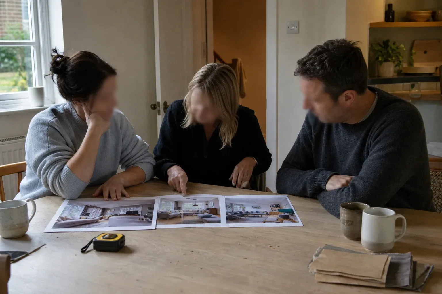
A concept meeting can be lost in twenty minutes with good work sitting on the table. The renders are strong, the client is pleasant, and nobody decides anything. The cause is rarely the images. It is the order they arrive in and what you say around them.
Anchor on the brief before anyone sees an image
Your client has been imagining their own version of this room since the day they hired you. If the first thing they see is your version, the meeting becomes a comparison between two schemes, one of which exists only in their head and cannot be argued with. Most advice on how to present design concepts to clients starts at the images. Start five minutes earlier.
Read the brief back in their words: what the room is for, the budget band, the constraints that cannot move, the date a decision has to land. Then ask whether anything has changed, and wait for a real answer. A client who has quietly raised their budget, or had a builder tell them the wall is structural, will not volunteer it once the pictures are up.
This is not throat-clearing. In Houzz research published for 2026, more than 40% of homeowners said a clearer timeline would have improved working with their pro, and the same share wanted better communication (Houzz 2026 State of the Industry, via KBBFocus). Put the recap on one page and hand it over. Everything later in the meeting gets measured against it.
Three options is not the same as three directions
The two words get used interchangeably and they describe different meetings. Three directions are three answers to the brief: a calm material-led scheme, a bolder colour-led one, a scheme that spends the budget on a single architectural move. Three options are variations inside one direction, the same room with three sofa shapes. Directions ask what the room should be. Options ask them to pick furniture.
Cap it at three, and two is often stronger. AI rendering has made variants nearly free — the Interior Redesign studio alone carries 53 styles across seven room types — so the temptation is to bring twelve because you can. Volume looks generous and behaves like abdication. Past about four, you have handed the client the job they hired you to do.
The specific failure is the composite: the kitchen from A, the lighting from B, the palette from C, and a scheme nobody designed. Present each direction as one complete argument and say plainly, once, that they are not interchangeable. The palette in the second scheme works because of the joinery in the second scheme.
The craft has moved upstream. Three prompts that differ by a few adjectives return three versions of the same scheme — a different cushion, a different rug, one warmer wall. Directions that differ in intent have to be described as different intents: what each one spends the money on, what it deliberately refuses to do, where the light is supposed to come from. That is decided in how the variants get generated, not in how you talk about them afterwards.
Then there is the order inside the set. Conventional advice says save your favourite for last, because people remember endings. In a concept meeting the ending is where the clock runs out, so the last scheme gets the least questioning and the shallowest agreement, and shallow agreement is what reopens six weeks later. Show your recommendation first or second and say that it is your recommendation. Studied neutrality withholds the judgment you are paid for.
How to present design concepts to clients: a running order
This assumes 45 to 60 minutes on a single room, in person or on a call with screen share.
Recap the brief with nothing on screen
Two to five minutes. Their words, the budget, the constraints, the decision date. End on a direct question and wait.
Name the constraints out loud
The structural wall, the window that cannot move, the lead time on the joinery. Said before the images these are facts. Said afterwards they sound like excuses.
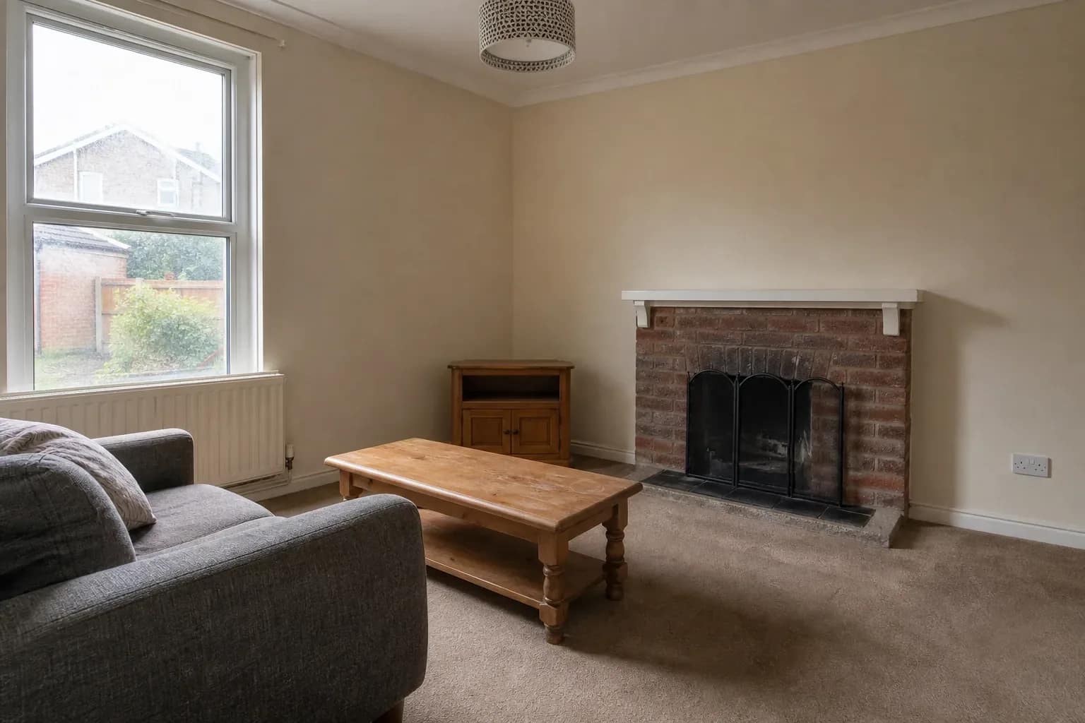
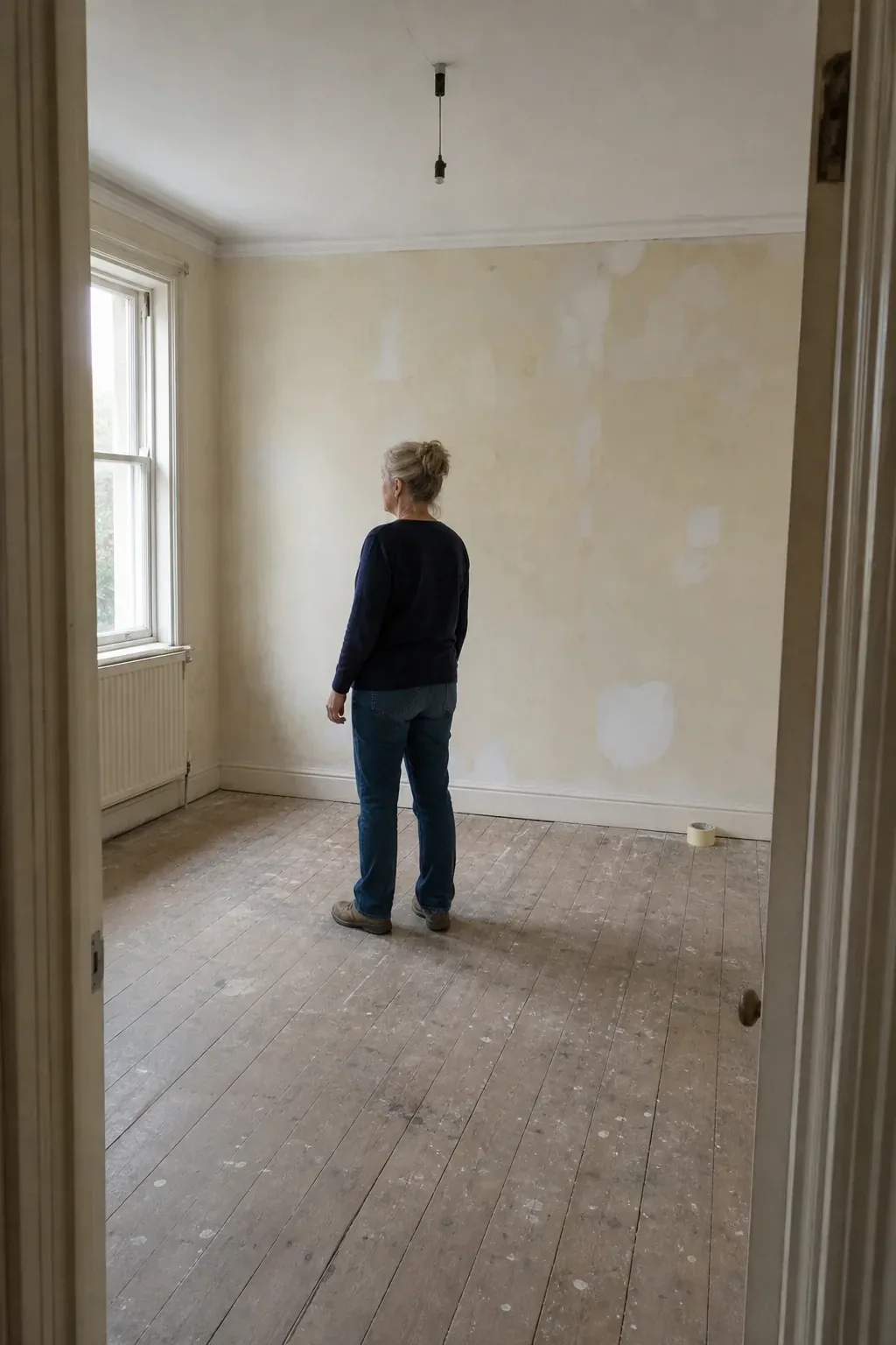
Show the base photograph of the room
Ten seconds on what is actually there. Everything after this is measured against it.
Show the directions as mood, not as rooms
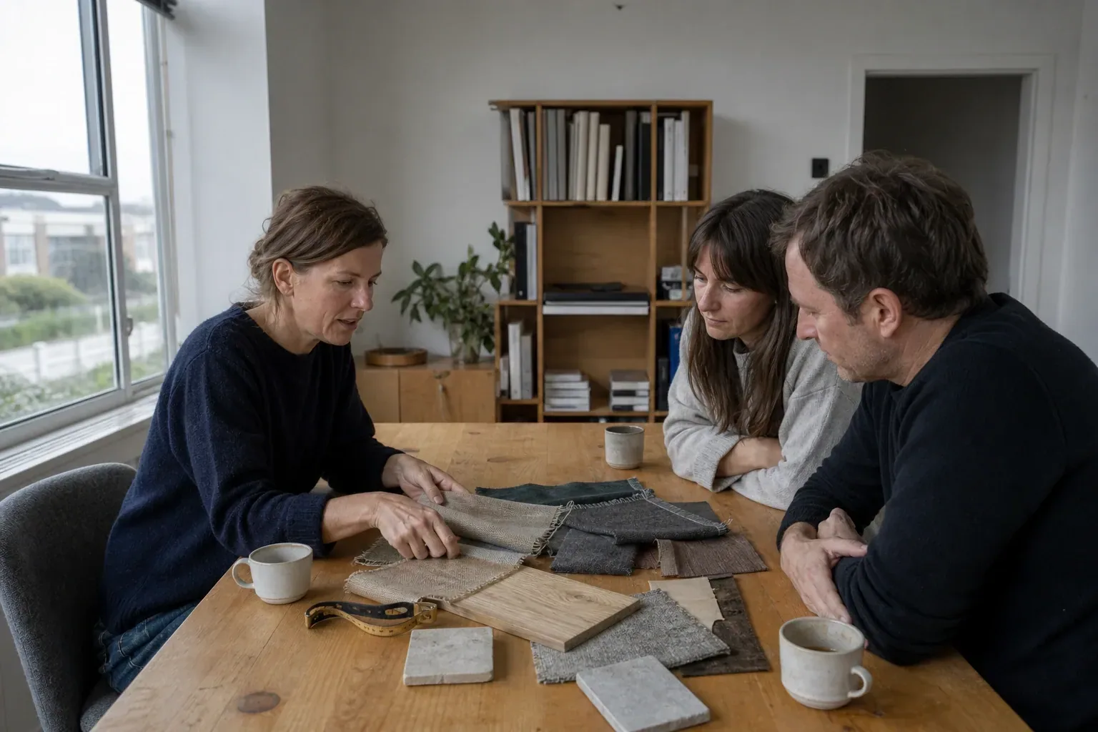
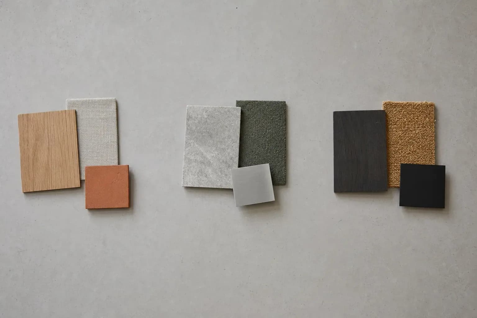
One board per direction: palette, material family, level of pattern, quality of light. No furnished renders yet.
Ask for a direction and stop
Which of these is the house you want to live in. Do not move on until one is chosen or ruled out. This is the decision the meeting exists for.
Render the chosen direction only
Two views of one direction beat one view of three. Consistency between the two views is most of what makes it read as a place rather than a picture.
Say what the render is
The disclosure sentence, every time, before they have stared at it. Wording is below.
Write the decision down and read it back
Three lines on the recap page: what was chosen, what was rejected and why, what is still open. Read it aloud and get a spoken yes.
Book the next date before anyone stands up
A date agreed in the room beats an email thread. The gap between meetings is where schemes drift.
Two things there carry the rest. The direction is chosen before any render appears, so the render confirms a decision instead of making one. And the decision is read back while every decision-maker is still in the room and still paying attention.
What each item in the concept pack is doing
| Item | What it settles | What you are asking for |
|---|---|---|
| One-page brief recap | Budget, timeline, fixed constraints, what the room is for | Confirmation it is still right |
| One mood board per direction | Palette, material family, pattern, formality | A choice of one direction |
| Two renders of that direction | How it reads in their actual room | Reactions and corrections, not new ideas |
| Marked-up plan | Circulation, footprints, what physically moves | Confirmation nothing structural is assumed |
| Open-questions list | The scope of round two | What the next meeting answers |
The mood board is what protects the render
Rendering has traditionally been the expensive commitment. In the 2025 State of Architectural Visualization survey of roughly a thousand architects and designers, 43% named slow rendering times as a major challenge, the most cited problem in the study, while still images remained the dominant deliverable and only 26% produced animations frequently (Chaos and Architizer).
AI changes the size of that commitment, not its existence. A render costs credits, and it always costs client attention. The same Houzz research found 73% of interior designers reported 2025 revenues below expectations, and 57% named increasing efficiency as their top priority for 2026 — which in a concept meeting mostly means not rendering the same room twice.
A mood board buys agreement on mood, palette and material family for a fraction of what the same agreement costs once a finished image is on the table. The Mood Boards studio runs this as a guided wizard: one photo of the actual room becomes moods you refine and integrate, so the boards stay anchored to their space rather than to finished projects on a pinboard.
Lock five things at this stage and nothing else: palette temperature, material family, level of pattern, lighting mood, formality. That is enough to make the render predictable. Forcing anything more granular turns a mood board into a specification meeting nobody prepared for.
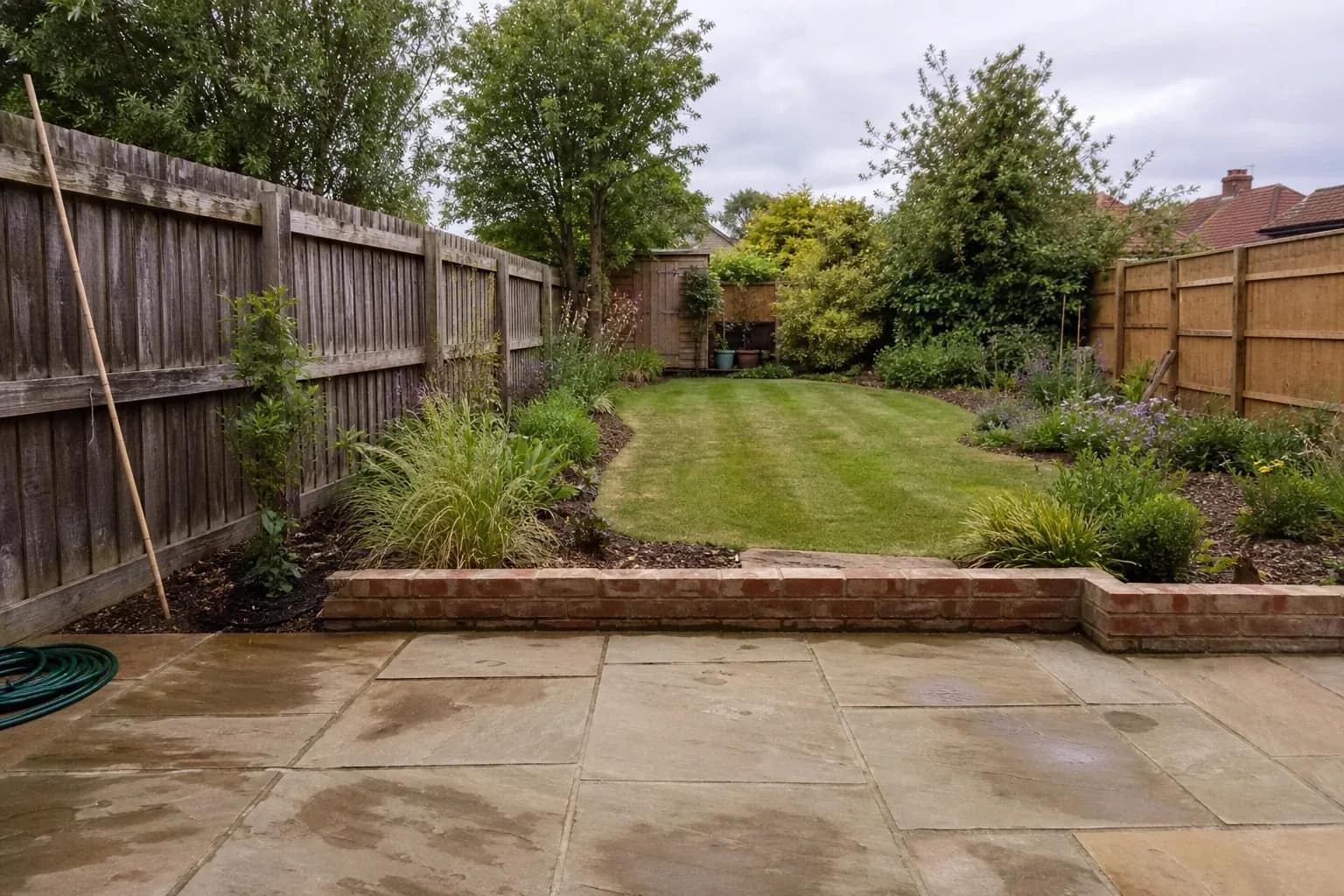
The sequencing holds outside interiors, though what the board settles changes. Presenting a planting scheme has to deal with time as well as taste, and presenting an exterior scheme has to survive being seen from across the street by people who never commissioned it.

Say what the image is, and what it is not
Show an AI render without framing it and the client will assume it is a photograph of a decision. That fails twice over: it is not honest, and it hands them a document they can hold you to.
There is no benefit to being coy either. Among Realtors surveyed by NAR in 2025, 46% reported using AI-generated content while only 17% said AI had made a significant positive difference (2025 REALTORS Technology Survey, PDF). Generated imagery is ordinary in the property world now. Assume your client has seen plenty of it.
Say a version of this out loud the first time a render goes up: This is a concept image. It shows the direction — palette, materials, quality of light. It is not a survey of your room, it is not a quote, and anything in it we have not specified yet is the software filling a gap. Those gaps get replaced with real products before you sign anything.
Put the short version in writing on every sheet: concept image, indicative only, specified items listed on the schedule. That line is the difference between a conversation about a substitution and an argument about a promise.
And keep the base photograph next to the render, every time. It stops their memory of their own space being overwritten by your image of it, and it makes the scope of the change legible at a glance.
The detail they fall in love with that you cannot build
Every designer working with generative renders has had this meeting. The client barely looks at the scheme and points at a corner of the image, and it is the one element that cannot be built: the window seat, the run of glazing, the pendant with the impossible arm.
This is a property of the tools, not bad luck. Chaos, which makes V-Ray and Enscape, is unusually blunt about it: generative tools have no working grasp of scale, distance or human ergonomics, and will produce combinations of proportion and material that could not physically be constructed. Its advice is that output should always be reviewed by a design expert, especially anything client-facing (Chaos on AI tools for interior design).
A designer testing the mainstream tools hands-on found the same failures with names attached: one completely changed the orientation of the room while still producing a convincing image, another kept adding extra windows and doors, and bedding was weak across the board (Spaces by Dee). A realistic render of the wrong room is the dangerous one, because nobody thinks to check it.
So check it. Sixty seconds an image, against the base photograph rather than your memory:
- Count the windows and doors against the photo.
- Follow the floor through every doorway. Material that changes halfway is an invented threshold.
- Check ceiling height against a fixed reference: a door head, a cornice, a light switch.
- Look at every mirror and pane of glass. Reflections are where the model invents a room that is not there.
- Find the radiators, sockets and vents. If they have vanished, note it, because they are coming back.
- Open every door in your head. A door that swings into new joinery is a change order.
- In bedrooms, look hard at the bed. Pillow counts and hem lines are a persistent weak point.
Pre-empt the rest with an exclusions line rather than an apology: artwork, plants, accessories and soft furnishings are indicative, and anything specified is on the schedule. Say it once, at the start of the images.
When they fall for something anyway, never answer that it is not real. Cost it instead. That opening is a lovely idea and it is not in the scheme, so it means an engineer, a building control application and roughly this much. Do you want it priced, or shall we get the same effect another way? The artefact becomes either a variation you get paid for or a decision they made themselves.
When the second view comes back as a different room
Two views of one scheme is the minimum that makes a room legible, and it is also where generative rendering most often gives you away. Ask for the same living room from the doorway instead of the window and the boucle can return as leather, the rug can lose its border, the pendant can grow an arm. Nothing has malfunctioned. Each image is a fresh answer to a description rather than a camera moved inside a model of a room that persists between shots, so the second answer is free to differ from the first.
The same mechanism produces the more expensive version of the problem. A client approves an image, then asks for one correction — lighter sofa, warmer floor. Re-running the description with that adjustment re-rolls everything else in the frame at the same time, and what comes back is a different room that happens to have a lighter sofa. The client is now arguing with your correction while comparing it to a memory of the image they approved, which is a conversation you cannot win.
Three habits contain it and none of them cost anything:
- Generate both views in one sitting, from one description, and compare them yourself before either is shown. Two minutes at the desk; a lost meeting otherwise.
- Download the approved file the moment it is approved and treat that file as the deliverable. Do not assume you can reproduce it later from the same settings.
- Make small corrections locally. Inpaint Edit has you brush one region and describe the change, and nothing outside the brushed area re-renders — which is the whole difference between a corrected image and a new one.
Say the limit out loud when it matters. If someone asks for a third angle late in the meeting, the honest answer is that a third angle is a fresh generation and needs checking against the first two before it joins the pack. That small admission is what buys you the time to check.
The silent client, and the one who redesigns it live
Opposite symptoms, usually the same cause: something in the brief recap did not land.
When nobody says anything
Silence is usually processing rather than disapproval, but you cannot invoice processing. The common mistake is filling it with more options; the client reads that as a lack of conviction, and now there is more to process.
- Ask a closed question with a forced choice: of these two, which is closer? Not: what do you think?
- Ask them to remove rather than add: if you had to take one thing out, what goes?
- Ask the quieter partner first, by name, before the more vocal one sets the frame.
- Send the pack a day ahead, so the first silent read happens at home.
One designer describes most clients as imagination-impaired: they need to see it to understand how a space comes together (Spaces by Dee). Silence often means the image has not registered as a real room yet, and a second view of the same space fixes that faster than a second scheme.
When they start designing in the room
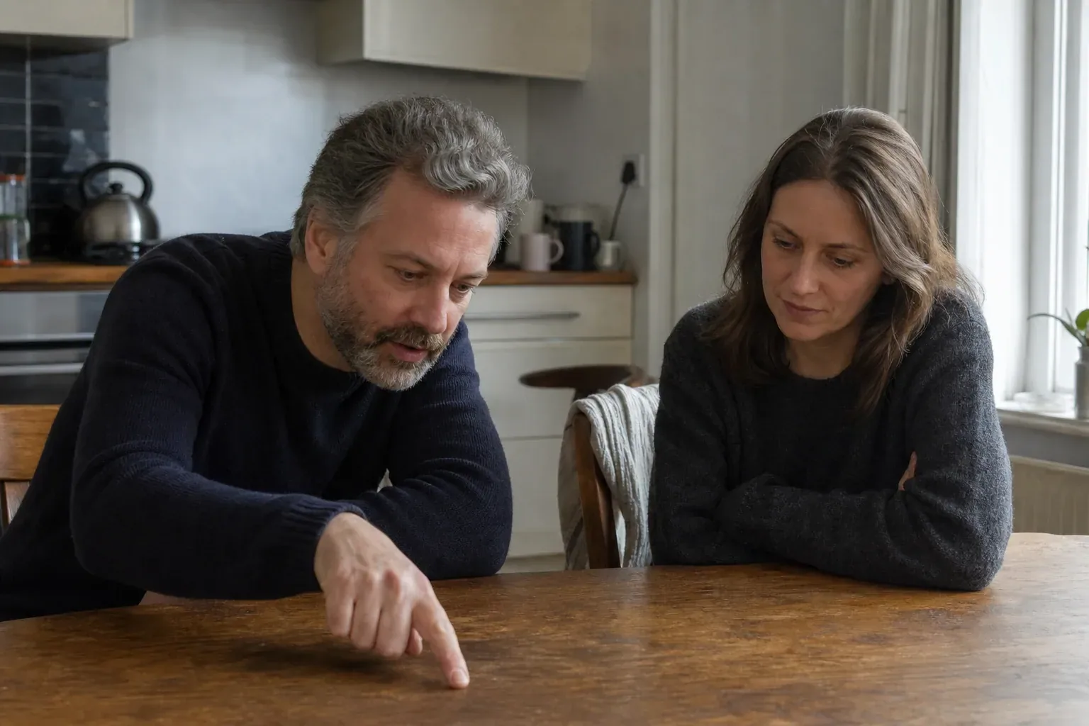
The client who begins moving your furniture around out loud is rarely being difficult. They are telling you the recap missed something, or that they do not feel heard. Arguing scheme-by-scheme never works, because the target keeps moving.
Write it down where they can see it. A visible list proves you heard them, slows the pace, and makes its own length obvious to everyone including them. Name the consequence once, calmly: that one moves the sink, which moves the drainage, which is a two-week item and a cost. Then park it for round two.
Underneath the meeting-room skills this is a contract question. Decide in advance how many revisions to promise in writing, because a number already agreed on paper is what lets you say yes to a fourth change without resenting it.
What to send after the meeting, and when
Within 24 hours, before memories of what was agreed start to drift. One PDF. Not a folder of images, not a gallery link, not four separate emails.
- The decisions, in three or four lines, in the words you read back in the room.
- What was rejected, one line each. This is what stops a scheme reopening in week six.
- The images, captioned, each alongside the base photograph.
- The open questions, with a name against each and a date.
- The next meeting date, already agreed.
Version-stamp everything and put the version in the filename, not only inside the document. When four PDFs in a thread are all called Concept, the newest is not reliably the one being argued about.
Send print-quality files if the client will print them; enhance and 4K upscale run on any render from the Starter plan up. Never send watermarked exports to a paying client. The free tier watermarks everything, which is fine for testing a direction and not fine as a deliverable.
Only 26% of the designers and architects in that same Chaos survey produce animations frequently. The survey does not say why, and the presentational consequence is the same either way: a short moving clip still reads as something extra rather than as the baseline. Render to Video turns an approved still into a 1080p clip on the Pro plan, 16:9 for the PDF or 9:16 for a phone. Use it on the approved direction only. Animating a scheme nobody has chosen is an expensive way to confuse someone.
Common questions
- How many design concepts should I present at the first meeting?
- Two or three directions, and only one of them rendered in detail. Past four, clients start assembling a composite out of parts. Needing to show more usually means the brief is not tight enough to design against yet.
- Should I tell the client the renders are AI-generated?
- Yes, as a description rather than a confession. Name what the image is doing — direction, palette, light — and what it is not: a survey, a quote or a specification. Say it before they have studied the picture, and repeat the short version in one line on the sheet itself, so the framing travels with the file when it gets forwarded to a builder.
- What if the client asks to see every style the software can do?
- Show the mechanism, not the output. Generating variations is cheap; narrowing the field before their attention runs out is the work you are paid for. Offer one extra direction if they genuinely have not seen themselves in anything, and set the limit out loud when you offer it.
- Does any of this work over a video call?
- Yes, with two adjustments. Share one image at a time rather than a grid, because a grid invites a composite and makes it easy to build one on screen. And read the decision list back before anyone leaves the call: on a call there is no conversation in the doorway afterwards to catch whatever was left ambiguous.

Written by
Axisnook Editorial Team
Design visualization writers at Axisnook
The team that builds and supports Axisnook, writing from the render queue rather than the press release.
- Interior and exterior design visualization
- AI render workflows and prompt design
- Client presentation and revision process
- Real-estate listing and virtual-staging disclosure